G'day, welcome back to Colecandoo.
In this episode, we're going to look at items that appear in square brackets.
You'll see these in some panels, such as all of the styles panels, the swatches panel,
and the preflight panel, just to name a few.
So, what about them?
These items are special because they are the default values that ship with InDesign and
cannot be renamed or deleted, and in some instances, cannot be edited.
Let's start by having a look at the swatches panel.
By default, the InDesign swatches panel looks like this.
There are four colours that are in square brackets: None, Registration, Paper and Black.
Notice all but one of these colours can't be edited as indicated by the strikethrough
pen icon.
Interestingly, we can edit the paper colour, so I'll create a new document to demonstrate
this.
Anyway, with nothing selected, let's change the paper colour by right-clicking it on the
swatches panel.
Bonus tip: right-click on a style or colour to edit it instead of double-clicking with
the left button to avoid inadvertently applying what I'm changing to something that might
be selected on the page.
The panel appears, and note that I can't change its name or colour type,
but can choose a colour mode of Lab, CMYK or RGB, but nothing else
Let's change it to 100% Cyan, just for fun.
What happened here?
The page has gone blue!
Will it look that way if I export to a PDF?
Well, no.
Instead the page is white.
So, what's happening here?
The paper colour is not pretending to be white, but rather mimicking the colour of the substrate
that the artwork is being applied to.
This could be used to show what artwork would look like if printed on newsprint, so let's
change that colour to a newspaper-like colour.
However, I'll undo this, as there is a better way of simulating that colour, and that is
to go to the view menu, select proof setup, and click Custom.
In the new dialog box, select simulate paper colour, and choose a profile I want.
However, colour proofing and matching is a video series all on its own,
so let's focus back on the brackets.
In this new document, let's look at this colour called registration.
It's a unique colour that appears on every colour separation, whether it's cyan, magenta,
yellow, black, or a spot colour.
It's meant for prepress marks such as crop marks, registration marks or slur marks.
It should NOT be used as a colour for applying to general artwork as it will go beyond the
ink density for paper.
Ink density is a limit where the amount of ink in a particular location can't be absorbed
by the paper and will wrinkle or will cause drying issues with the paper.
Ink densities vary depending on the stock that is being used.
In this example, I don't want the density to be higher than 300%.
In my separations preview, from the dropdown, I can select ink limit,
and notice that the majority of the page has become red,
telling me that my ink limit is beyond 300%,
so I need to change this colour to something else.
In this situation, I would prepare a colour called "rich black".
I'll start with an open square bracket and type in rich black and end with a square bracket.
*CLAXONS*
I receive an error message, saying invalid swatch name.
Please choose another.
This is the other feature about square bracketed items, they generally belong to default items
and you generally cannot name a new swatch, style or item with square brackets
with three exceptions:
Stroke styles;
A flattener preset;
or a trap preset.
Back to my rich black.
I'll just call it "rich black" and I'll give it the values that I like to use
in a rich black.
If you disagree with these values, please post in the comments the values you believe
the rich black should be.
And now my ink limit is all good.
OK, so that worked, but I don't really want to select registration by mistake,
because it looks exactly like black.
I can't rename it "don't touch", I also can't delete it,
can I put it in a folder called "don't touch"?
No
However, I can move it to the top of the list, so now I know to avoid using this colour,
but that will only make that setting for this document.
To do this for any future documents, I have to close all of the documents I have open,
and then make my change.
So just to prove that these swatches can't be deleted, let's go select all unused.
And it selects all of the swatches except for the square bracketed ones,
but for some reason it's left Cyan.
Any reason it doesn't select Cyan?
I'll give you some thinking music.
*THINKING MUSIC*
Worked it out?
It's because Cyan is used in the Basic Paragraph style.
If I go to my paragraph shading, you'll see it's used as the default shading.
If I change that colour to black,
I should be able to select all unused and it will select Cyan as well, right?
*CLAXONS*
Well, no, no it doesn't.
It's not that simple, Cyan still isn't selected from the select unused colours option.
Instead, we have to get rid of Cyan, and replace it with black.
I can then add Cyan back in, it's not a hard colour to add,
Just move it to where it was because, I'm picky.
And now, if I go select all unused, it selects everything
except for the square bracketed items.
While some square bracketed items can be altered, I'd also exercise caution in changing them
if sharing files with others, given that these items are in every InDesign file.
But when an item is copied from one file to another and has the same style name, the copied
item adopts the formatting of the document it's being copied into.
If I look at the basic graphics frame in the left hand document, you'll see it has a fill
of Magenta applied to it, it has a rounded corner applied to it, and has this gaudy drop
shadow applied to it.
So, when I copy that and paste it into my new document, it's now a white square, because
the basic graphics frame in the right hand document had no fill applied, had no rounded
corners, and has no drop shadow.
Now, this behaviour is true of any style, default or otherwise.
But it's a good reason to generally leave most of the defaults alone.
Lastly, I often hear the advice given generally about exporting high quality PDFs if working
with a commercial printer.
However, this setting doesn't preserve bleeds or crops, and has to be added separately,
so let me demonstrate.
When I navigate to the marks and bleeds, I have to add the crops, add my page information,
and use my document bleeds which were three millimetres which you can see down here.
But note once I've done that, it adds the word "modified" to the end.
So, while I can export this PDF and it will appear correctly,
if this is something that the user needs to do all of the time
and they follow the same instructions, they navigate
to high quality print,
they have to set this every time.
So my opinion would be to make a new setting.
That's it for another video.
If you got something out of this video, show me by hitting the like button,
and subscribe for more great videos.
Check out colecandoo or InDesignSecrets for the latest articles, or tweet me @colecandoo.
Until next time, I'll see you later.
 For more infomation >> Volkswagen up! 1.0 60pk 5drs Beats Executive | Airco | LM velgen | DAB - Duration: 1:01.
 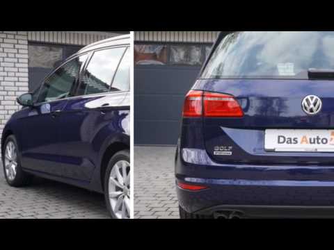 For more infomation >> VW Golf Sportsvan - Duration: 1:01.


 For more infomation >> Sono Tornato... E ORA? - Duration: 1:21.
  For more infomation >> Citroën C4 Picasso 1.6 E-HDI LIGNE BUSINESS NAVIGATIE/ LED-DAGRIJVERLICHTING/ TREKHAAK/ PDC - Duration: 1:02.
  For more infomation >> Citroën DS3 1.4 e-HDi Chic dealer onderhouden! trekhaak! diesel! AUTOMAAT! 1e eigenaar! - Duration: 0:55.
 For more infomation >> Fabrício Zava - Vem - INTERSECÇÕES (Áudio Oficial) - Duration: 2:53.
  For more infomation >> A Missão LISA Pathfinder - Duration: 3:44.
  For more infomation >> Trivia - Perithon - Duration: 0:38.
  For more infomation >> Por trás do Card | Amara, Égide da Esperança - Duration: 7:26.
  For more infomation >> Nós vamos morrer de fome! - Duration: 4:26.
 For more infomation >> VOCÊ PODE CONTROLAR SUA DIABETES COM ESSE PODEROSO REMEDIO - DR NATUREBA DICAS NATURAIS - Duration: 1:56.
 For more infomation >> New Homes in Dallas Texas - Frisco Lakes by Del Webb - Duration: 3:46.
  For more infomation >> Campo harmônico maior no Teclado - Aula 9 (Guia do iniciante) - Duration: 5:39.
  For more infomation >> TERRADOIS | Tolerância zero | Parte 1 - Duration: 16:32.
  For more infomation >> Billions of girls crazy crazy how to whiten the whole body after a night with only one sweet potato - Duration: 3:38.
  For more infomation >> Ăn Dứa Liên Tục 7 Ngày Vòng 1 Tăng Vù Vù Căng Tròn Trông Thấy Da Trắng Mịn Lại Giảm Cân Hiệu Qủa - Duration: 14:44.
  For more infomation >> 1 Lá Nha Đam "THẦN DƯỢC" Đánh Bay Nám Da Sạm Đen Biến Mất Da Trắng Hồng Chỉ Sau Vài Tuần - Duration: 10:54.
  For more infomation >> Volvo C30 1.6D SPORT R DESIGN! leer! trekhaak! prachtige staat! - Duration: 1:02.
 For more infomation >> Star Wars: TIE Defender (Legends) - Spacedock - Duration: 4:58.
 For more infomation >> Volkswagen Transporter 2.5TDI LANG DC 130552KM T-EDITION RAVENNABLAUW - Duration: 1:03.
  For more infomation >> Opel Meriva 1.4T 120PK EDITION NAVIGATIE - Duration: 1:02.
  For more infomation >> Opel Mokka 1.4T 140PK Edition / Climate / Navigatie - Duration: 1:02.
  For more infomation >> Opel Mokka 1.4T 140PK Edition / Navigatie / Climate Control - Duration: 1:02.
  For more infomation >> Opel Astra 1.4T 120PK Edition 17'' LM Velgen/ Trekhaak - Duration: 0:59.
  For more infomation >> Opel Meriva 1.4T Cosmo Automaat Navi/ Clima/ 17'' LM - Duration: 0:54.
  For more infomation >> Opel Astra 1.0T 105pk Edition / Navi / Climate / 17" LM - Duration: 0:58.
  For more infomation >> Opel Mokka 1.4T 140PK Cosmo Navi/ Leder/ Clima/ Pdc - Duration: 1:00.
  For more infomation >> Opel Astra 1.0T 105pk Edition / Navi / 17" LM / Clima - Duration: 0:54.
  For more infomation >> Opel Corsa 1.0T 90pk 5d Edition / Airco / IntelliLink / PDC - Duration: 1:01.
  For more infomation >> Opel Astra 1.4T 120pk Blitz / Navi / Airco / 17" LM - Duration: 0:58.
  For more infomation >> Opel Astra 1.4T 140pk Automaat Edition / Navi / Airco / 17" LM - Duration: 1:03.

 For more infomation >> Exam Skills: 4 tips about staying motivated - Duration: 2:43.

No comments:
Post a Comment